With this project we prepared a graphic image to complete the branding strategy of Alegria Hotels to differentiate itself from the competition and in the face of consumers in the tourism sector.
Alegria Hotels.
Alegria Hotels is a hotel chain founded in 2012 and based in Santa Susanna (Barcelona). This young hotel chain has 18 3 and 4-star category hotels distributed throughout the main tourist destinations on the Spanish coast located in Catalonia, Valencia, Murcia and Andalusia: Costa Cálida, Costa Azahar Costa de la Luz, Costa de Barcelona, Costa del Sol and Costa de Almería. Its vocation is to achieve excellence in service to customers who choose the Spanish coast as their holiday destination.
Its range of experiences is based on excellent value for money, prepared facilities with the right quality, and personalised attention to guests. Among its experiences, its services for Families, Adults Only, Spa, Golf and Cycling stand out. Its values demonstrate its belief in the local culture of the destinations where its establishments are located, its commitment to quality, the innovation and training of its professional team, and its responsibility towards the environment.
The challenge
The solution
.Results
.The challenge
Until a few years ago, consumers in the tourism sector were not so demanding of tourism establishments. Hotel chains did not see the need to specialise because that kind of demand did not exist. At that time, customers chose their holiday destinations based on various factors: prices, the location of the hotel and the experiences offered (sun and beach, city, wellness, etc.). However, this lack of demand disappeared after the coincidence of new factors that conditioned the way hotels sell: the boom of the Internet, the change that this boom has brought about in the behaviour of users and the saturation of companies in the hotel sector.
Faced with this new situation in the tourism sector, customer demands are much higher than in the past: it is no longer enough to comply with basic conditions to attract customers to establishments; consumers want unique experiences and value for money. For a hotel chain to adapt to the new pace of the tourism sector, differentiation is essential. Customers are faced with a multitude of tourist brands, and if consumers identify with the values they convey, they will choose one brand or another. The brand brings together the image and values intangible of an organisation. This is why branding has gained greater importance today in the hotel sector.
The logo, the claim, the corporate colours, the values… all these factors have to reflect the branding strategy of any hotel establishment. And for these factors to get your company’s message across to consumers, it is essential to apply them correctly in the communication of the organisation. Without a correct application of the brand in all its formats, the brand will not reach the target audience in a homogeneous way, and it will not be able to complete this differentiation with the competition.
Alegria Hotels had intangible values, a mission and a identity defined. But to transmit all these factors, it still required one more element to get its differentiating message across to consumers: a graphic image that would serve to transmit the personality of Alegria Hotels through its graphic communication and in all its applicationss. A coherent, homogeneous and undistorted graphic image decisively favours the social identification of the company. The challenge for Alegria Hotels was, therefore, to obtain a graphic image that would transmit the hotel chain’s commitment to its values of quality, innovation and expansion, as well as to unify the same message for all its tourist establishments and in all existing applications.
The solution
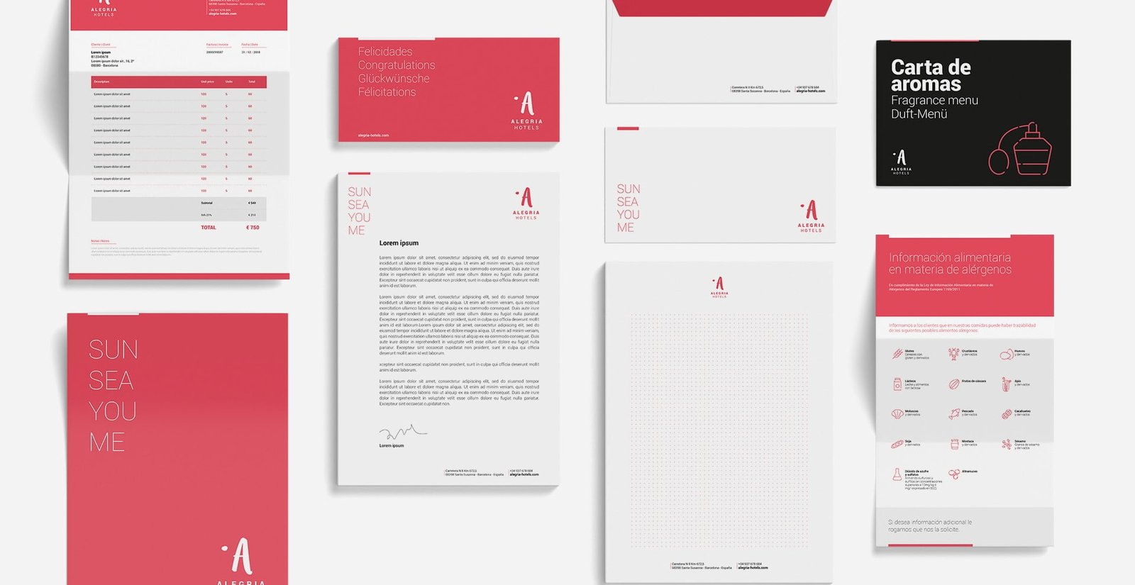
.With the aim of achieving a graphic image in line with the values of Alegria Hotels, we worked on a coherent graphic style that covered the different essential factors in the image of any organisation, which we divided into four phases: logotype, graphic elements, communication systems and brand architecture.
1. The logo
.
We developed a main logo in which the capital “A” became the protagonist symbol of the hotel chain’s identity, leaving the name in the background. This name, on the other hand, had different typographic characteristics to the symbol of the logotype. The aim was to design a descriptive logo linked to the business area of Alegria Hotels. Along with the main logo, two main versions were presented (without background, or with a coloured or black tablet background) and a secondary version, so that Alegria Hotels would have diverse formats of the logo in case its uses were restricted by its different formats. We then worked on the logos of the Alegria Hotels sub-brands. We segmented the brand in relation to its three differentiated products: Live (generic product), Love (family product) and Feel (adult product). Finally, based on the main logo, the logo for the Apartments service of the hotel chain was designed, so that the identity of the flats would be different from that of the hotels.
2. Graphic elements
.
The colour is one of the main visual assets of the brand. For the corporate palette of Alegria Hotels we chose main colours, secondary colours and their chromatic gradations. The main colour of Alegria Hotels is coral, which forms part of the main logo and was chosen as the main colour in the brand’s applications, while black, also the main colour, is used preferentially in the brand’s applications that require its use. The sub-brands also acquired their colours, so that they are protagonists in their context, and broadening the corporate palette. The corporate typography defined was “Roboto” and in all its extension (regular, black, bold and light); its use contributes to the correct legibility and hierarchy of the information, so that it extends to all the printed and online communications of the hotel chain.
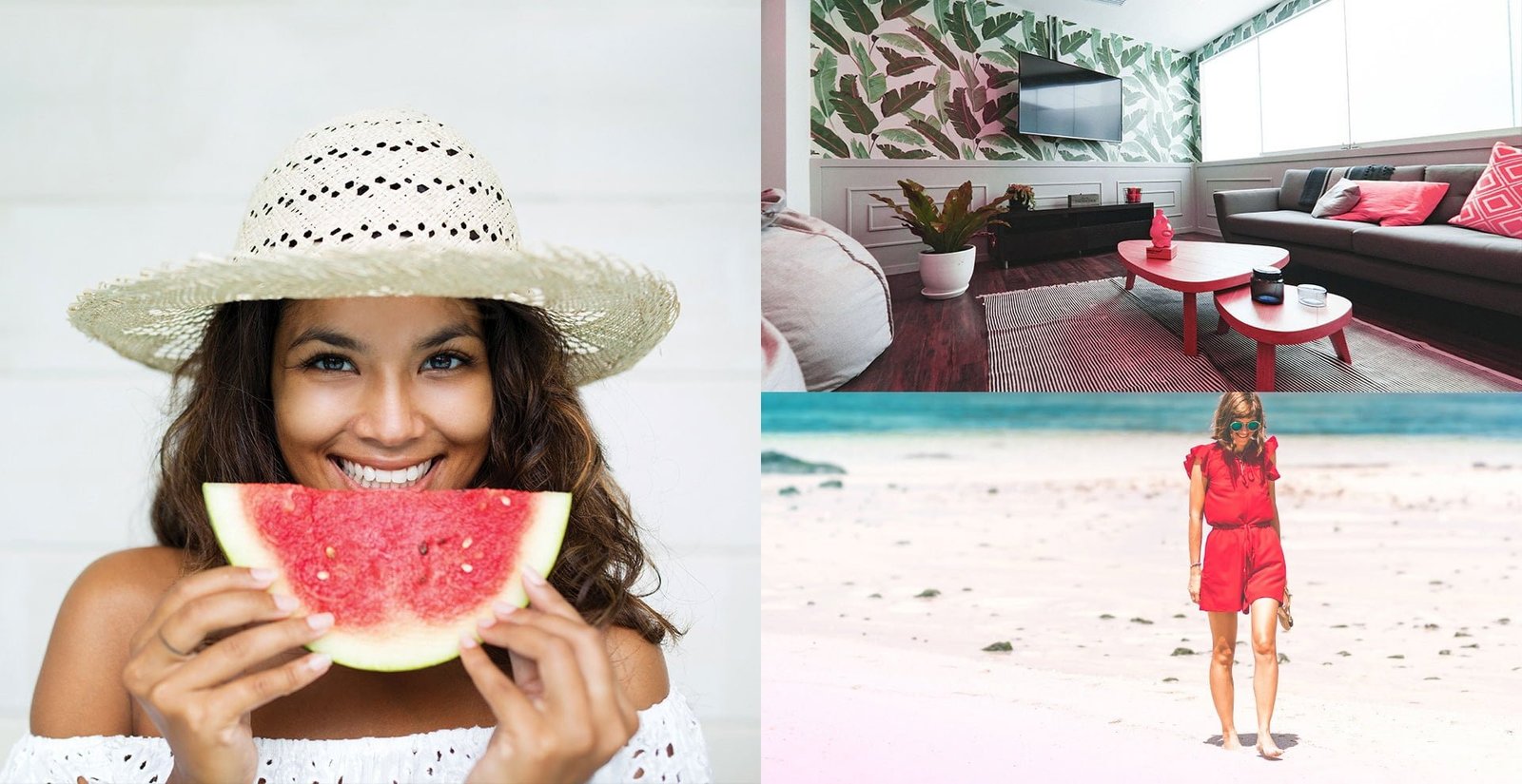
As for the product photography, it was essential to choose images that had the power to transmit the brand identity. The right photographs for the Alegria Hotels brand had to fit in with the corporate colour palette, as well as sharpness and a frontal perspective. To achieve a more personal style, we developed decorative photography that could be used in the event that secondary images were used for brand applications. For example, to use background photographs. In order for Alegria Hotels to carry out the brand applications appropriately, we made a proposal for decorative elements so that the applications would comply with a uniform vision of the brand. As a final graphic element, we made a proposal for an iconographic style that would help to bring more coherence to the organisation’s applications. This iconography consists of a style of open, rounded lines and non-organic shapes to achieve a modern aesthetic and smooth appearance, as well as being a visual reinforcement of the idea that appears in the texts, or even replacing them.
3. Communication systems
.
In order for the communication systems to be fully realised, we designed a grid system so that in complex communications where it is necessary to apply different levels of information (image, text blocks…) the information can be organised in a simple way. This grid is made up of 7 columns (and as many rows as necessary) with asymmetrical margins, so that the layout of the elements is always homogeneous and balanced.
4. Brand architecture
.
The declination system should be unified and coherent, to facilitate the construction of the brand architecture, its understanding and its identification with the global identity. To this end, we present the way of constructing the logos of the hotels included in the different product sub-brands of Alegria Hotels. This exhibition includes a vertical version and a horizontal version, a version of the Exclusive seal, another for the logo of the Apartments of the chain, and a logo for those hotels that do not fall within the product segmentation.
After the development of this graphic style, we prepared a corporate identity manual prepared to specify to all members of the Alegria Hotels team how to correctly apply the graphic communication of the hotel chain both in terms of corporate identity and in the sub-brands of Alegria Hotels.
Results
.After applying our solution, Alegria Hotels now has a graphic image that differentiates it from the competition in the tourism sector. Its brand acts correctly as a differentiating factor, causing a visual impact that is marked among consumers. Today, the graphic style of Alegria Hotels makes a decisive contribution to giving the brand a socially identifiable profile. The success of our branding solution is particularly reflected in these points:
- The Alegria Hotels logo is present in all its applications. Thanks to the various versions we designed for the hotel chain, the logo has been successfully applied in the organisation’s different print and online formats.
- A graphic style associated with the brand. We have managed to define a graphic style that differentiates the company and that is transmitted in all its applications. Thus, we have built a homogeneous and differentiating graphic identity.
- A graphic style associated with the brand.
- A unique and creative brand. Its identity as a young company in search of innovation and expansion is clearly reflected in its brand, with an innovative logo and striking colours that transmit the personality of Alegria Hotels.
- Alegria Hotels.


We present the way of constructing the logos of the hotels included in the different Alegria Hotels product sub-brands. This exhibition includes a vertical and a horizontal version, a version of the Exclusive seal, another for the logo of the chain’s Apartments, and a logo for those hotels that do not fall within the product segmentation.
A graphic style associated with the brand
.
We have managed to define a graphic style that differentiates the company and that is transmitted in all its applications. Thus, we have built a homogeneous and differentiating graphic identity.